
LCS: Fashion Statement
By Michael Dell, editor-in-chief
Thinkin' about layin' down 70 skins for a new hockey jersey? That's air-knit replica, of course. The real thing will cost well over $100, even $200 if it features a swell Nike swoosh on the bottom. That's a hefty investment, especially if you're broke like we are here at LCS.That's why we figure it is our duty to clue you, our valued readers, into the coolest jerseys in the NHL. By following our rankings you'll at least be able to make your next purchase a wise one.
Teams are ranked 1 to 26 on the combination of both their home and away jerseys, although a preference between the two versions will be given. Third jerseys were not rated or taken into consideration since, well, they all blow.
Keep in mind we're not evaluating the entire uniform, just the jerseys. After all, when you go to the mall you don't buy the socks and pants to kick around the hood with the other O.G.s... I honestly have no idea what the last part of that sentence even means.
The ratings were determined by a number of factors. We can't really go into them now since they are so complicated, but our system is very similar to the one used by Star Search. The one constant theme, however, is coolness. When in doubt we just asked ourselves a simple question: "Would the Fonz wear it?" Actually, asking what the Fonz would do in a situation is a good way to lead one's life. I know it got me through dental school.

The Fonz
One last thing, when trying to write about and describe a whole bunch of things, such as all the jerseys in the NHL, it is hard to come up with new adjectives to keep the article fresh throughout. So, LCS broke out several old school terms. Play along at home and see if you can find 'em.
LCS is now proud to present the coolest jerseys in the NHL... to build the suspense, we'll start at the bottom.
26. New York Islanders: Well, duh? Just looking at the Islanders makes me hungry for some tar tar sauce and french fries. It's tough to come up with a phrase to describe the Islanders uniforms, but "candy-ass monkey suits" does nicely.
The idiotic logo has been beaten to death in the pages of LCS in the past, and rightly so, but the rest of the jersey isn't exactly top notch stuff either. If not for the inclusion of grey, the wavy shoulder lines would be tolerable. There are just too many contrasting colors making up the aforementioned lines. It's really just a mess.
With that said, next season when they officially replace that dork on the front with the old trusty Isles logo, LCS wouldn't mind owning a few. They'll still be ugly. But they'll be just ugly enough that, well, they'll be cool. The lighthouse shoulder patches are also pretty nifty.
Home or Away: Like it matters. Either one will draw the laughter of men, women, and children alike, not to mention the fright of small woodland creatures, wherever you choose to travel.
25. Los Angeles Kings: If ever a team was in desperate need of a make-over, it's the Los Angeles Kings. Once the gang-land appeal of silver and black wore off, the Kings were done. And what's up with that logo? It looks like a jello mold.
Sure, the old purple and yellow jerseys with the Parkay logo were ugly. But, and this goes back to the same principal mentioned earlier in the Islander review, the old Kings jerseys were so ugly they were cool. See how that works? Plus, Bernie Nicholls broke into the league wearin' one of them. That doesn't hurt at all.
If anyone out there has one and is willing to part with it, don't be scared to send the email. It was always a dream to own an old Kings jersey in tribute to Broadway Bernie.
LCS apparently isn't alone in missing the ol' days. The Kings are reportedly considering bringing back a little bit of the purple and yellow next season, along with a totally new logo.
Home or Away: Home white.
24. Boston Bruins: Outside of the Fishstick Boys, this is easily the worst revamped jersey of the lot. I wonder if Bruin management still has the crack pipe they were smoking when they decided to change jerseys last season? The vertical stripes down the sleeves are absolutely brutal. The new bear depicted on the shoulders also looks drowsy and uninterested. Although, he does have to watch the team play every night...
Home or Away: If a gun is held to your head and you are forced to purchase one, go with the road jersey. At least it's black, so you can try and hide in the shadows when stuck wearing it.
23. Anaheim Mighty Ducks: When the logo for the team was first unveiled, one thought came to mind: "Damn, that's stupid." First impressions are tough to shake. The kooky slanting line at the bottom doesn't really help matters much. And the color scheme is nauseating. The Ducks are exhibit A in why purple should not be used as a primary color in jerseys. The Baltimore Ravens are Exhibit B. Although, as mentioned above, those old purple and yellow Kings jerseys were bad as hell. But they were the rare exception. Word on the street is that the Ducks might drop the purple in time for next season.

Damn, that's stupid...
Anaheim did make one nice addition to the jerseys this year with the circular "Mighty Ducks of Anaheim" shoulder patches. Hey, even a blind chimp finds a banana now and then.
Before we leave the subject of the Ducks, I must make a confession. I actually own an Anaheim jersey. A purple road one, too. However, and this is key, I purchased it on sale and then got "Kariya" on the back. Pardon granted.
Home or Away: Go with the home white.
22. San Jose Sharks: Everybody loves teal! Well, guess what? We ain't everybody. The Sharks jerseys created such an uproar among fans when they were introduced back in 1991 that few noticed that they were really, really lame. If the presence of teal wasn't enough, the fin shoulder patches are always a solid source of ridicule.
That's not to say that a San Jose Sharks jersey wouldn't make a damn fine birthday present for, oh I don't know, maybe an Ace Reporter? Especially when the second choice was a pinata filled with eggs.
Home or Away: Definitely home white. Yeah, definitely.
21. Florida Panthers: The Cats' jerseys are not real easy on the eyes. The word "garish" comes to mind. Primary colors are swell, but that's a little silly. The road jerseys are just way too bright and colorful. Make sure all epileptics stay at a safe distance. They also have palm trees on their shoulders. Whether a hockey jersey or shirt for all occasions, that's never a good sign.
Home or Away: The home whites will induce fewer seizures.
20. Tampa Bay Lightning: It hurts, but it must be said. The jerseys of the Tampa Bay Lightning, the very sweaters that LCS hero and the idol of millions from eight to eighty Johnny Cullen routinely dons, are not that good. There's just something about big circular logos featuring a body of land that rubs us the wrong way. The differing striped patches under the arms is definitely unique. Unfortunately, the first time you see them you immediately wonder if the club just ran out of material and was trying to hide the mistake.
Home or Away: Not a great deal of difference. LCS would probably lean towards the home white.
19. Ottawa Senators: Ottawa is one of the most disappointing teams in the league. When the Senators first entered the NHL in 1993, their jerseys were bad. Then the club got all wacky on the junk and decided to update the sweaters before the 1995-96 season. The general color scheme, emblem, and shoulder patches remained. Unfortunately, the striping on the sleeves and along the bottom were changed. No goooooood. The stripes just look like they don't belong. They're so big, bright, and thick, they take away from the classical design of the sweaters.
Home or Away: The home whites are void of the ridiculous stripes. The black road jerseys are awful.
18. New Jersey Devils: The Devils' jerseys are just so... so... well, so-so. They're just there. Nothing hideous, yet nothing spectacular either. If it's one thing LCS hates, it's indecisiveness. Right, Zippy?
(EDITOR'S NOTE: This is an inside joke referring to Zippy's annual problems selecting players during our in-house hockey pool draft. Only seven other people on the planet will get the joke, but that's six more than usually gets them, so I went for it).
C'mon, El Diablo, take a stand! Either be cool or be like the Islanders, but don't ride the fence.
Home or Away: It doesn't really matter. They're both about the same. Might as well get the road red, that way you'll at least feel you're gettin' more for your money... with the cost of dye and all.
17. Vancouver Canucks: Vancouver is a tough call. The black, gold, and red scheme isn't for everyone. It seems people either love it, or hate it. There isn't much room for compromise.
The logo itself is original, and gay all at the same time. A skate made up of streaking lines? Well, at least it beats the old yellow "V" jerseys. What else could they do? There just aren't a lot of possibilities. Rumor has it that the Canucks are in for a total uniform overhaul next season. So enjoy these while you can.
Home or Away: Home whites are nice. The road black can be a bit overwhelming.
16. Philadelphia Flyers: There's just not much one can do with a club called the Flyers, either. Considering the circumstances, the winged P isn't all that bad. The black and orange also bring back memories of Halloweens past... the candy, the costumes, the fifty-dollar fines and time served...
Home or Away: Get the road orange. That's not exactly a color that comes along too often, so snag it when you can.
15. St. Louis Blues: St. Louis is an interesting subject. If the entire uniform were being discussed, then they'd be further down the list. The Blues' pants and socks just don't go well with the road sweaters. However, on their own merits, the jerseys themselves aren't too shabby.
While the diagonal lines often catch grief, they represent sheet music, so that's pretty cool. The big flaw in the St. Louis jerseys are the numbers. There's really no excuse to have the numbers not overlap the diagonal lines. As it stands now, the numbers get misshapen in order to fit the uneven horizon. Not a good idea. If the numbers were normal, the St. Louis sweaters would have scored a lot higher. It's tough to beat them wacky trumpet shoulder patches.
Home or Away: This is a tough call. The home whites definitely look better with the rest of the uniform, but the road blue is swell when worn by itself.
14. Phoenix Coyotes: At the beginning of the season the Coyotes would have probably ranked lower, but since that time LCS has had the pleasure of seeing the jerseys in person. For some reason, jerseys always look better in person than on TV.
That's not to say the desert dogs' duds are perfect. Far from it. Let's face it, the logo is just plain nutty. Although that's not necessarily a bad thing. The first real major drawback to the jerseys is the Midwestern design around the collar, cuffs, and bottom. It's just too thick, too busy, too much. Combined with the logo, it's enough to send former acid users into a flashback. Also, on the replica versions of the sweaters, this part of the jersey is made of some sort of goofy material reminiscent of wrist bands and sweat socks. That's odd.
Then there are the enormous circular moon patches that read "Phoenix Coyotes" just in case the players forget who they are playing for in the middle of a game... oh boy. It would have been bold if the club left off the team name and instead just went with only the crescent moon shape. Now that would have been a statement. But they didn't, so it isn't. If the patches were different the Coyotes would have scored a lot higher.
Home or Away: Road black is where it's at.
13. Buffalo Sabres: Another one that looks better in person than on the tube, Buffalo did a pretty good job of changing their look this season. The design is original, but the drastic contrast of the black and red is an acquired taste. Depending on the person, the color scheme will either be annoying or sharp. We tend to gravitate towards sharp.
The twisting white buffalo head as the new logo is interesting. The white buffalo has long been considered a symbol of good luck by some Native American cultures. Although, this particular depiction of the mythical beast makes it appear as though he is chewing fleas and ticks from his back. That's a nice touch.
The one overwhelming flaw the Buffalo jerseys are burdened with is the lame shoulder patches. A letter "B" with a sword through it? Gimme a break. It's like an episode of Sesame Street. "Today's jersey is brought to you by the letter B!" It would have been nice if the Sabres would have used the old logo as the shoulder patch. They could have redone it in black and silver. That would have been real wizard.
Home or Away: If you like black, the road sweater will give you your money's worth. LCS, however, chooses the home white.
12. Hartford Whalers: The Whale have some smooth threads. They can't go out pimpin' with 'em, but they're smooth none the less. The blue, green, and silver are easy on the eyes. And the Whale tail is synonymous with style. The only thing missing are the old Dickie the Whale shoulder patches the club used to sport back in the day.
Home or Away: Both are real nice. Blue or white, you'll be the hit of any gathering while wearing the sea mammal's colors.
11. Dallas Stars: If not for the weak stripes down the sleeves of the home jerseys, Dallas would be in the top five simply on the strength of its swanky road sweaters. The only downside to the road version is the white numbers and letters. The Stars used to have dark green, but were forced to change when announcers complained that it was too hard to read 'em. Damned announcers. They should mind their own business.
Here's a tip, tho', when considering purchasing a Dallas jersey. Go with the Starter version, not the CCM. Starter stitches the logo directly onto the jersey. CCM uses a big ol' patch, causing the jersey to hang all kooky. Starter good. CCM bad.
Home or Away: The road black Starter version may be the nicest jersey on the market. Good luck finding it.
10. Calgary Flames: LCS gave the Flames a whole mess of grief when the new duds made their debut a couple years ago. Now they're ranked 10th. Hey, things change...
Actually, if considering the entire uniform from top to bottom, the Flames would probably be in the top three. The jerseys are strong on their own, but when combined with everything else the result is dy-NO-mite. The red, gold, and black seem to symbolize the harvest and all that is good with the land of Alberta. The flaming C is still one of the best logos around.
Home or Away: Road red.
9. Washington Capitals: The Caps made a wise decision when electing to change their uniforms last season. Their old ones looked like they were stitched by Betsy Ross. And that's not really a good thing.
The stylized eagle may be a bit weak, but the blue, bronze, and black scheme is a winner. The real saving grace of the jerseys are the shoulder patches, which depict the U.S. Capitol building, and the lettering. Few jerseys, if any, look as nice as a road blue Capitals sweater all lettered up... especially if it's in honor of the one, the only, Peter Bondra.
Home or Away: Road blue is exceptional.
8. Pittsburgh Penguins: The Birds get bonus points for having two distinctive designs for home and away. The whole flip-flop-of-colors thing gets a little old.
At the Igloo, the Pens look sharp in the white and gold with black trim. Some in the Pittsburgh area still prefer the old skating penguin to the current logo, but, well, they're drunk. The new logo is real boss.
Then on the road, the Pens skate wearing black trimmed in gold and white, with "Pittsburgh" written down the front. That's a classic look. However, the penguin emblems on the shoulders are what really make the jersey special. In fact, they make the jersey so special that the Penguins are mulling over the idea of losing the "Pittsburgh" and replacing it with the normal home logo next season.
Home or Away: The road black is real groovy, but it might sweat the Rangers a bit too much. The home white is a true individual.
7. Chicago Blackhawks: The Hawks still have one of the most recognizable jerseys in the game. The logo is classic and the tomahawk shoulder patches are the best in the business.
Home or Away: Go with the home white. The black and white stripes at the bottom of the road sweaters tend to dominate things a bit too much.
6. Edmonton Oilers: Usually when uniforms get redesigned, it's done by corporate suits that aren't aware of what's down on the beat, cold in the joint, or tight out on the street. Yet somehow the Oilers managed to do the job right.
The fine folks of Edmonton wisely kept the same classic Oiler logo that has five Stanley Cups to its credit, electing instead to change up some of the striping and introducing a golden-bronze color to the mix. They also added some zany shoulder patches depicting a goalie and an oil well. Don't look now, but somebody's creative...
Having seen the glory of the Oil's new sweaters for himself, Zippy swears the new gold trimming glows with magical powers, almost to the point of being hypnotic. So keep that in mind when going to purchase one. You may want to bring along a designated driver.
Home or Away: They're both real nice. However, the road blue is one of the best in the game. Get that lettered up with Doug Weight or Curtis Joseph and you'll be all good.
5. Detroit Red Wings: Sometimes style and simplicity are one in the same. The Red Wings have a very simple design, but it doesn't come off looking plain. The road sweaters are drenched in red, with only three white stripes to help accentuate the storied winged-wheel logo. The home whites feature a totally different design, always a plus, and are just as crisp with only the red and white scheme. Detroit sweaters also have another factor in their favor: tradition. Being able to pull on the same style jersey Gordie Howe once wore is a good thing.
Home or Away: Either one is smooth. White may be slightly better but if you're looking for a red jersey, the road Detroit sweater can't be beat.
4. New York Rangers: The red, white, and blue work well together. Once again, the slight variation between the home and road sweaters is a nice touch. The diagonal "Rangers" down the front may not seem all that special, but it's good enough for the Penguins to blatantly rip it off. And again tradition weighs heavily in their favor.
Home or Away: They're both extremely strong. Home white could get the edge simply because the shoulder design is so unique.

Kamensky Stylin'
3. Colorado Avalanche: Feet patches and all, no jerseys look cooler in person than those of the Colorado Avalanche. While the Red Wings only need two colors to achieve greatness, Colorado showed it could be done with as many as five. Using blue, burgundy, black, white, and silver, the Avalanche color scheme has set a new standard. The logo, featuring a puck zipping around a sturdy mountain-esque letter "A", personifies the strength and speed of hockey. The jagged baseline cut also brings to mind the mountain range where the club calls home. To truly see the jerseys at their best, make sure to get them lettered. The font used is unique to the Avalanche and the dual- color trim sets the numbers off nicely.
Home or Away: Road burgundy is one of the game's best, holding a slight edge on the home white... but not by much. Can't really go wrong with either.
2. Toronto Maple Leafs: During the 80's the Leafs sweaters were awful. Then in 1992, the acquisition of Doug Gilmour sparked a renaissance in Toronto Maple Leaf hockey that brought with it new uniforms. Instead of electing to go to some nutty new-age design, the Leafs turned back the clock and structured the uniforms after those of a by-gone era. Toronto kept the newer updated version of the Maple Leaf logo, but the basic jersey design and striping is almost identical to the ones worn by the club during the days of King Clancy. The team strengthened its ties to the past by stitching a miniature version of the original leaf logo on the shoulders. By remembering the past, the Leafs have solidified their grand tradition for today's generation.
Home or Away: Road blue might have a slight advantage.
1. Montreal Canadiens: Hockey is a game of tradition. And no one team represents this better than the Montreal Canadiens. Their sweaters have remained the same since the glory years of Maurice Richard and Toe Blake right up until the current reign of Saku Koivu.
They also just look good. The Club de Hockey logo is simple, yet profound. The red, blue, and white color scheme gives the jerseys a classic appeal. The red shoulders on the home whites make the two versions of the sweater distinctive and individual to themselves.
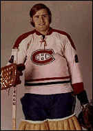
Old-school Ken Dryden
The bottom line, though, isn't what the jerseys look like, but what they mean. There's just something special about owning a Montreal jersey. With each passing day it gets harder and harder to find remnants of hockey's glorious past. Even the legendary Montreal Forum was toppled by the ever-present quest for modernization. The Habs' sweaters are one of the few remaining symbols of the game's greatness. They need to be respected and revered as such.
Home or Away: Perfection either way.

LCS: guide to hockey © copyright 1997 all rights reserved